Wednesday, November 30, 2011

Anti-Pragmatic Manifesto

Mark Jarzombek

Contextualism is finally dead, let’s face it – except as a survival mechanism in some parts of academe and in the profession. Maybe it is for the best. Its promises from the 1970s never really materialized except to make architecture invisible and bland – a pawn for the status quo – to beat down the imagination of young designers. The turn in the last decades toward sleek neo-modernism has contributed to the death of context; it has created a welcome historical “break.” Modernism comes to the rescue again! But is it enough or will it spiral into the farmlands of phenomenological determinism?

There was once a presumption that contextualism – code-worded in the US as “history” – required eo ipso a foundation of knowledge and thus a sense of intelligence. That equation, sadly perhaps, was too ambitious and perhaps, in fact, flawed. History turned out to be too complicated to integrate in design studio education. Design encountered the difficulty of history, the difficulty of sustained reading on the difficulty of modernity, (the difficulty of reading Foucault Lacan and Derrida, for example) and baulked.

For a while “theory” as it was called became a viable host for the discipline’s intellectual energies and ambitions, but now there is a battle for its life and soul. It is facing the same problem as “history,” dying slowly in front of us – in the studios, in halls, in our universities! It has become a style, a way for students to get a job.

Theory, as an interrogation of architectural purpose, needs to be saved before it goes down with the ship – before its emptiness is revealed to itself; before our heroes are made hollow. We have words like flow, diagram, and critical written large on a page, but without sub-text, without sub-sub text - texts without erudition - without even a modicum of psychoanalytical reflection – an episteme without epistemology.

Soon S.O.M. will be doing “folds.”

I predict a new fascination with carelessness, a new tolerance for “whatever” in a “whatever generation” - an architecture that prides itself on neither history nor theory, to put it bluntly. This generation will take over the mantel of the “avant-garde,” and demand that it vacuate itself of purpose and thought.

Computation – though not the cause of this crisis - will float through it unscathed; computation has shown that it survives best in arid landscapes, squeezing an infinite variety of possibilities out of nothing, soit seems. There are some efforts to turn the ship in the name of “parametric reasoning,” but will it work? Is it not all “too difficult.” Will computation ever meet abjection? That, probably, is too much to ask.

To get past the inevitable disillusionment - that will be the challenge of the immediate future, academe needs to open up the repressed values of pedagogy. There was a moment when this seemed possible with postmodernism and then with the attention in architecture schools, some 10 years ago, of so-called marginal spaces, with the desire to make architecture – and the architectural explanations difficult.

When are we going to reclaim the unmarginal spaces? When are we going to reclaim the center that is also rightfully ours! Where is our search for the impossible, for the impossibly big?

The process has, of course, begun, largely in the new global phenomenon of museum design. What famous architect has NOT designed at least ten museums – in ten different countries. But let’s face it, this is an ersatz architecture associated as it is with the commercializing of culture. These great museums are ALL a type of anti-center of the center that still waits to be claimed. We have reclaimed the right to make “objects,” brilliant objects for sure, but objects nonetheless.

Everything else be damned.

Central Park in New York – in case one forgets – is completely manmade; it was created over a tree-less garbage dump. Four million cubic yards of soil and rock had to be imported to the site. Five million trees and bushes were planted. Rocky outcroppings were “sculpted” into place, vast amounts of water pumped in. etc. etc.

The process of thinking big has partially begun forced onto us by the possibilities in China and elsewhere. But we can think big EVERYWHERE. Thinking big does no mean that one has to make big things. It especially does not mean that one is a problem solver. One must avoid the Siren Calls of the professionals and the pragmatists. Utopia can still excite!

When are we going to reclaim utopia for our discipline? When are we going to reclaim the possibilities and depth of our discourses?

Tuesday, November 29, 2011

Lee Sexton 8

The international airport in Osaka Japan doesn’t function like a typical airport. Instead of plans driving down the runway to take off, the structure retracts into the ground and allows the planes to drive right on top of it. When it is time for take off the arms of the structure branch out and begin to tense up and the BAM! The plane is shot up into the air and takes off from there. As it springs up the trampoline of the roof starts to wave is different directions as I goes back to its relaxed state sitting on the structure and the arms.

Alycia Schramm Blog 8


Undoubtably the most eccentric feature on Albany's Empire State Plaza, The Egg is an unprecedented piece of architecture that tells the story of its location. As the city's capital center, the plaza claims the most elevated space in the city. The Empire State Plaza contains very important buildings, such as the New York State Museum, New York State Executive Mansion, and an impressive art collection. The Egg, much like the Plaza itself, is set above its surroundings on a pedestal. Referring back to regality, its shape is held like the jewel in a king's scepter, in an arena of prominence and expressing the importance of the buildings it sits next to.

Blog 9+10

As the first semester of the history survey comes to a close, we have discussed a wide range of work – from ancient time telling devices, to burial mounds, temples and pyramids, to cathedrals, palazzi and even theatrical sets. This last blog response asks that you tell me which project, or idea, or book, or moment really, over the past semester did you find most interesting. Name the work, then explain why you think the way you think. Responses must be articulate, accurate, and compelling. This is not about personal taste or preference; it is about stating a position.

To paraphrase David Foster Wallace, this is not just a “Find-Out-What-The-Teacher-Thinks-And-Regurgitate-It-Back-at-Him response. Architecture, as we know, is not like math or physics—there are no right or wrong answers (though there are interesting versus dull, fertile versus barren, plausible versus whacko answers).”

Please post an image made (not taken) and your position (100-150 words) relative to the work.

Assigned: 29 Nov 2011

Due: By 8:00 am, 13 Dec 2011

Angela Liccardo, Blog Post 8


Louis Sullivan always adds extensive ornamentation to his building but not many people see more than just a manipulated geometric figure. The father of modernism was not just creating ornamentation that displays nature but he was creating an additional clue to finding the holy grail. But being an architect he got way too conceptual that no one caught on to the hidden secret. Guaranty Building displays the fifth science of geometry, best known as freemasonry. Through the expression of perfect circles and equilateral triangle, Sullivan begins to give us mapping clues to the holy grail. He chooses a different approach though, rather than pentagram, he uses a hexagram. This lost clue is currently being researched as being the answer to the new discovery.

Michelle Lopez Blog Response 8


The Schroder House tells the story of color. The Schroder House is the only piece of architecture that fully expresses the De Stijl art movement. When moving through this residence, one is at first taken back from the vibrant blues, reds and yellows. Primary colors as well as shades of white, gray and black are used as well in order to show the purest form of color. The thick black lines are used to show movement while primary colors are used to fill in spaces between the black lines. If one were to approach this building, they would be able to completely experience the De Stijl movement.

James Fulton -- Blog Response #8


Two designers with Atelier Hitoshi Abe, both dirtied and strained, stand firmly across from one another – their backs arched away, as though their minds were emitting ideas that were magnetically opposite. The light of the evening sky makes a bloody battleground of the heavily stirred mud between them while a rope, once white, then brown, now red – streaks taut against the sky.

The men lock eyes and then;


One: (Strained) – THIN

The Other: (Similarly) – THICK


The rope splits, and two ideas are free to exist opposite each other in Hitoshi Abe’s building for the Kanno Museum.

Dan Zarkadas - Blog 8


The Apple stores are examples of buildings that represent Apple’s ideals in a clear way and explains their vision of the future. The obvious thing about the building is the amount of glass. It’s extremely modern and pushes the boundaries of what can be done with architecture. The structure, which in the past used to be the defining feature of many buildings, is slowly being erased and replaced by nothing but clear, translucent forms. These buildings are like the markers of architectural advancement, like a portal to the future. Apple is a forward thinking company and they’re always looking towards what’s next, which is exactly what they aim to show through the series of stores they build. The latest of which takes it to the extreme, it doesn’t even look like it’s a building anymore, just a glass box, like an icon. The store is underground of course but it looks like there is nothing there, a reference to a future where we won’t actually need physical stores, just an icon on our desktops.

John Greene Blog #8

Everyday, living in Boston, we experience the the shear size of the John Hancock tower whenever we walk by or happen to see it in the horizon, but when the world was populated more by giants it was seen as something completely different. Today we know the Hancock as a residential and commercial space where the "small" people of today actually congregate inside this great tower for work and living, but prior to the major decrease in human height the John Hancock was actually used as a full length mirror for the giants of yesteryear. The 790 foot tower was a perfect fit for the 800-900 foot people that controlled most of the Americas thousands of years ago. Unlike most giants of their time, dirty and unkempt, the giants of New England were ones of sanitation and hygiene, so for them, the John Hancock was your last stop before starting your daily giant routine. Giants from all across New England would come and use the John Hancock Mirror wether it be before work if you were local or before a big event (ie. wedding, birthday, ect.) if you had to make a longer trip of it. Unfortunately as time went on people began to get smaller and smaller until our average height of 5-6 feet leveled out, and the ancient John Hancock Building needed a purpose, thusly the John Hancock tower we know today was born.

Monday, November 28, 2011

Blog 8 - Casey Delia

Simmons Hall on the MIT campus... dormitory? No. More like an ancient alien race temple recreated. As everyone knows, aliens always must fly back and forth in perfect rows. Casualties are going to happen, however they do not care as long as they try and destroy the defenders of space. To commemorate the aliens lost in battle, alien spies descended upon Cambridge Massachusetts to mind control Steven Holl into designing a dormitory that represented their fallen aliens in battle. To do so, Holl pushes and pulls parts of the building creating many volumes that sure do seem to look like voids where alien invaders should be.... O_o

Zachary Philippe- Blog 8


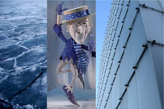
The Kunsthaus Bregenz facade is one of delicate ice. Being on the water, the architect chose a facade material that combines the solidity of land and the movement of water, forming one material that is both (depending on the temp), that material being ice. Ice is very delicate so instead of fastening or drilling through, the architect rests these shingle like pieces on metal stands. After a very long process of balancing these pieces on these stands, the facade was created. Working a nice deal with the Snow Miser, the architect no longer has to worry about the plates melting either.

Paul Woodworth_Blog 8

The MassArt building on the other side of Huntington Avenue exposes its structure on this corner to the street. The scale of this exposure, however, leads to questions about its true purpose. This detail seems to be quite reminiscent of what the building's aim might be: The black of the glass oozes down from the heavens, and it is the exposed structure which is able to keep the weight of the world at bay so that future generations can gain entry into the art world. Or perhaps it is so they can get out? The true answer probably lies in that black miasma that is the building's facade.

Matt Rowell- Blog 8

The New School of design building in New York City has been renovated by the creativity of Lyn Rice Architects. Not only are the majority of interior spaces filled with interchangeable walls so students can create their own interactive work space, but it contains a very intricate facade system that becomes just as interactive. The large-panel, deep-set, aluminum-framed windows are rotated 6 degrees towards the intersection and 4 degrees in section towards the sidewalk allowing for expanded views to and from the street. This attention to detail has allows students and pedestrians to experience the face more ands on. The tilting of the large window panes creates gathering spaces inside the facade on both interior and exterior that were never utilized prior to renovation.

Nick Dyer- Blog 8


If you think of a grocery store chain and what their stores look like, there are always similarities. Most Shaw's stores look the same, most Stop & Shop stores look the same, even other department stores have similarities (i.e. Dick's, Bob's, etc.) The reason for this is because people recognize the stores. They want to see something that they know. It's a comfort thing. But I've noticed a break in the pattern when it comes to Whole Foods Markets. This is an up and coming food chain that is all about natural foods and reusable materials. When a new whole foods is put in, i believe the intention is to use the existing building instead of demolishing and rebuilding in order to create a store that looks exactly like the others. So the result, are buildings that tell a story. Buildings that show a piece of what used to be. One store shown in the top middle of the image, looks as though the building was once a movie theatre. and instead of taking down this big towering icon off of the building, they used it to their advantage. Someone might see that from a distance and say, "hey what is that? it looks like a movie theatre!" and their friend would say "ah yes! it used to be, but now its the Whole Foods Market!" so this towering icon that reaches into the sky was once an icon for something else, but now an icon that everyone knows to be Whole Foods just because they chose to leave that piece of history.

Stephanie Goldsack Blog 8

The Aqua building in Chicago, Illinois was designed so the balconies appear on the building simulate the connection the building has between the sky and the water. They are formatted so they appear as waves where there are flat parts that allow the sky to appear. Using the glass to capture the refection around it, Gang Architects pull together both the sky and the ocean in one building by detailing the balconies on the facade. The balconies are attached so they look like they are just attached rather then apart of the building to help simulate the movement in the ocean.

Anette Balestrand Blog 8


UC Berkeley in California was established in the wake of the Gold rush. When the college built the Chang-Lin Tien Center, they hid the oldest and biggest secret of the founders of UC Berkeley in the Façade. It is all hidden in the detail where the copper panels meet the wall. When the sun hits the panels and casts its shadow on the wall it creates a map. The map leads to the founders gold collection, hidden from the world because the treasure was too large for any man to handle. Maybe one day someone will decipher the map and find the hidden treasure.